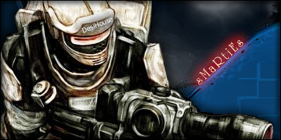
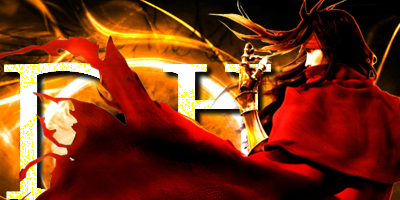
not bad, as dharmil said tho, they are a little big on the height side of things, this tends to annoy people if you are going to use them.. try using the standard size which tends to be around 100px in height and 400px in width..
the first one is blended pretty well, the second one the character needs to be blended a little more into the background but thats my opinion.. good work tho..
as said before they are a little high
and in the second siggy it's hard to read the letters. The cape is beautifull but making it so that it covers up the letters isn't the best idea ever
really nice signatures though
8.5/10 on the first one (if it wasn't so high and maybe a tad longer it would have been a 9)
8/10 on the second one (8.5 if see above)